Component Builder
The Component Builder is used to create custom components of a given type. In order to do this, OpenPlant Support Engineering provides template classes which help determine the values needed for each type of component. OpenPlant Support Engineering provides sample templates available in the sample projects included with the install. These templates are similar to the Model Objects so they use a similar class/properties structure. There are four classes that make up the templates starting with the Template Type class (Support Template), followed by the Description Class and the Geometry Class. The Geometry class contains a child class which is the actual Template class for the component. Each class has a set of definable properties.
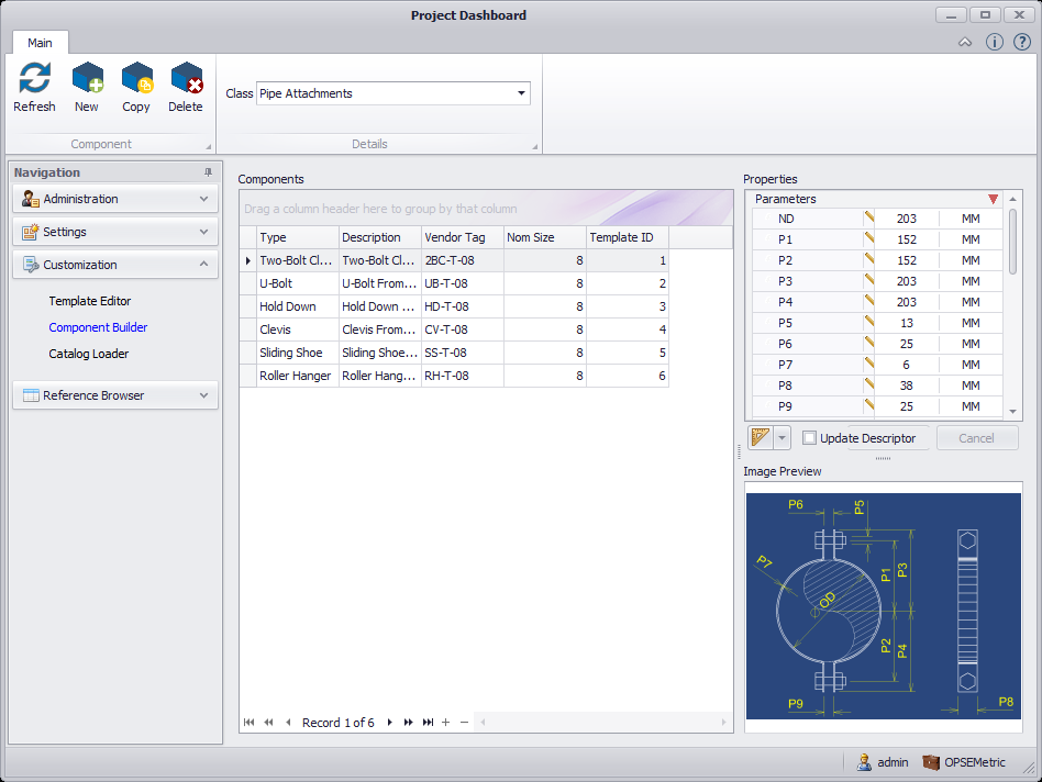
The Component Builder consists of 3 sections: Components grid, Properties and Image Preview as shown below:
Tool Bar Options
The tool bar options at the top of the interface are divided into different sections, each providing options for different functions/areas of the Component Builder.
| Setting | Description |
|---|---|
| Refresh | Refreshes the Component Builder with any changes made. |
| New | Click to display the New Component dialog where a new component record is created using one of the existing support templates. |
| Copy | Copies the selected Components records into the Component properties section. The word Copy will be appended to the original component item tag so you will know it is a duplicate. Modify the properties as desired then click the Save option to create a new component record in the Components grid. |
| Delete | Deletes the selected component. |
Details Toolbar Options
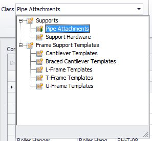
The Class drop down is used to help filter the Components table. It allows the selection of the Template Classes and will use the View in the refViews table to show components related to these templates. Currently, the view shows all components here, including ones made without templates, but we may change this later (or make templates for all of our existing components as well)
Click the arrow in the Class field to display a flyout of the available class templates:
Components Grid
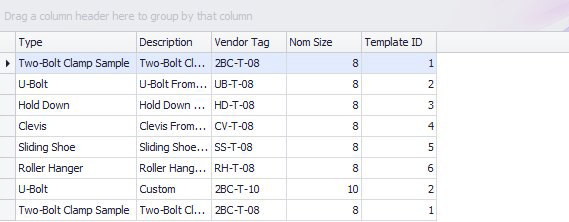
Shows a table of all the components associated to the selected Templates Class (currently it shows them all, not just components made with the templates).
Properties
The Properties section shows the properties for the component that is being created/edited. It is grouped into different collapsable sections as shown below.
Modify the property values as necessary and click Save to save the changes to the database.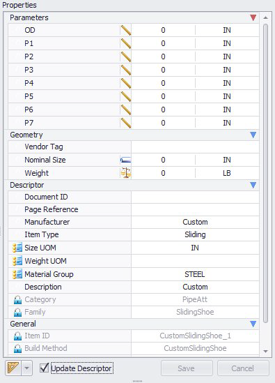
 Units
Units Image Preview
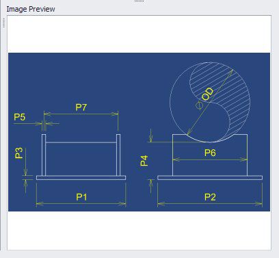
Displays the image that is defined in the Description. Please note that since the user may selected any image in the description, the values displayed in the image may not always match up with the values required in the Component. In the example in this image, you can see that the is no S1 value. Also, the names don't always match what the image shows which is also visible in this example since the Pipe Nominal Diameter is A in the image.